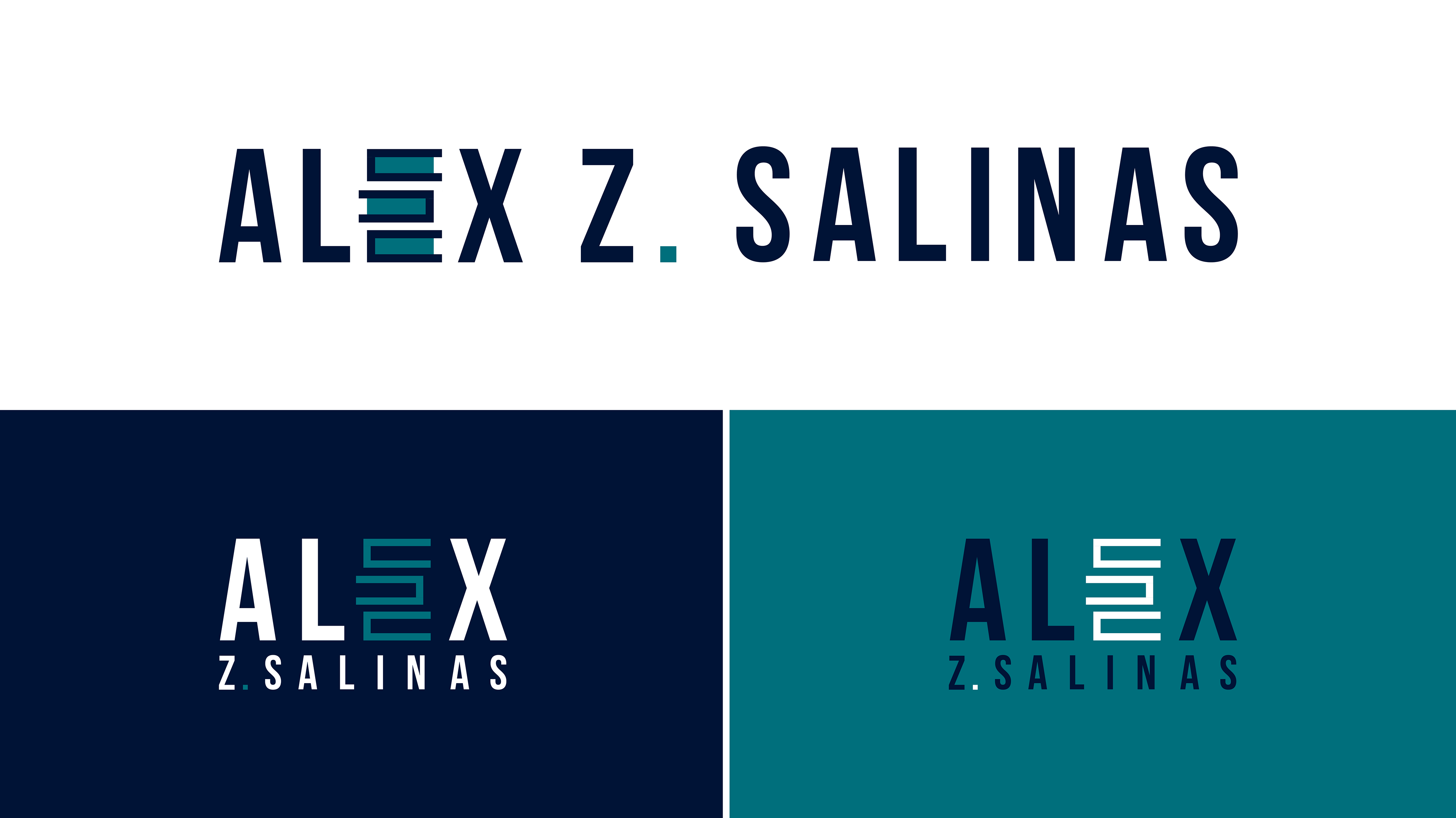
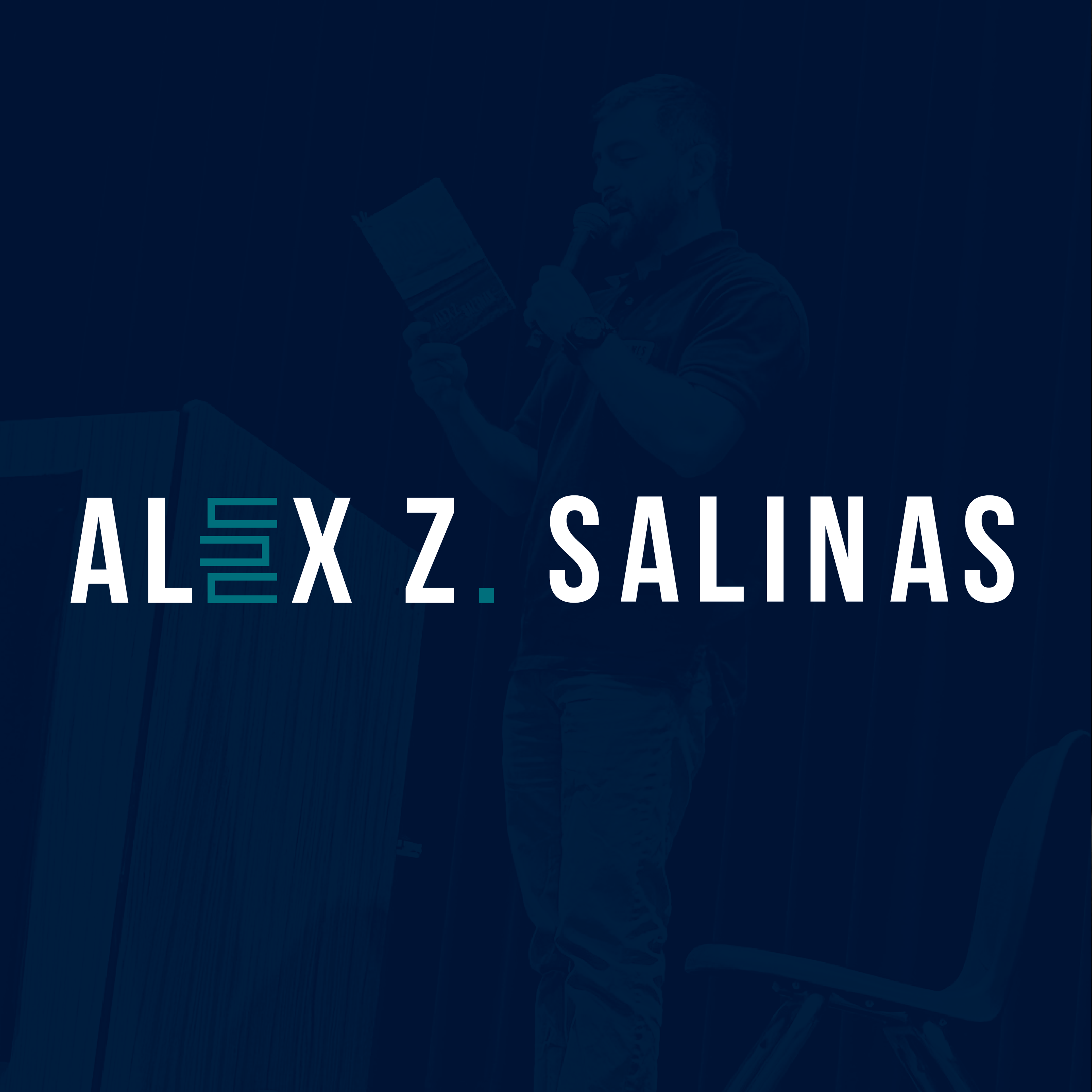
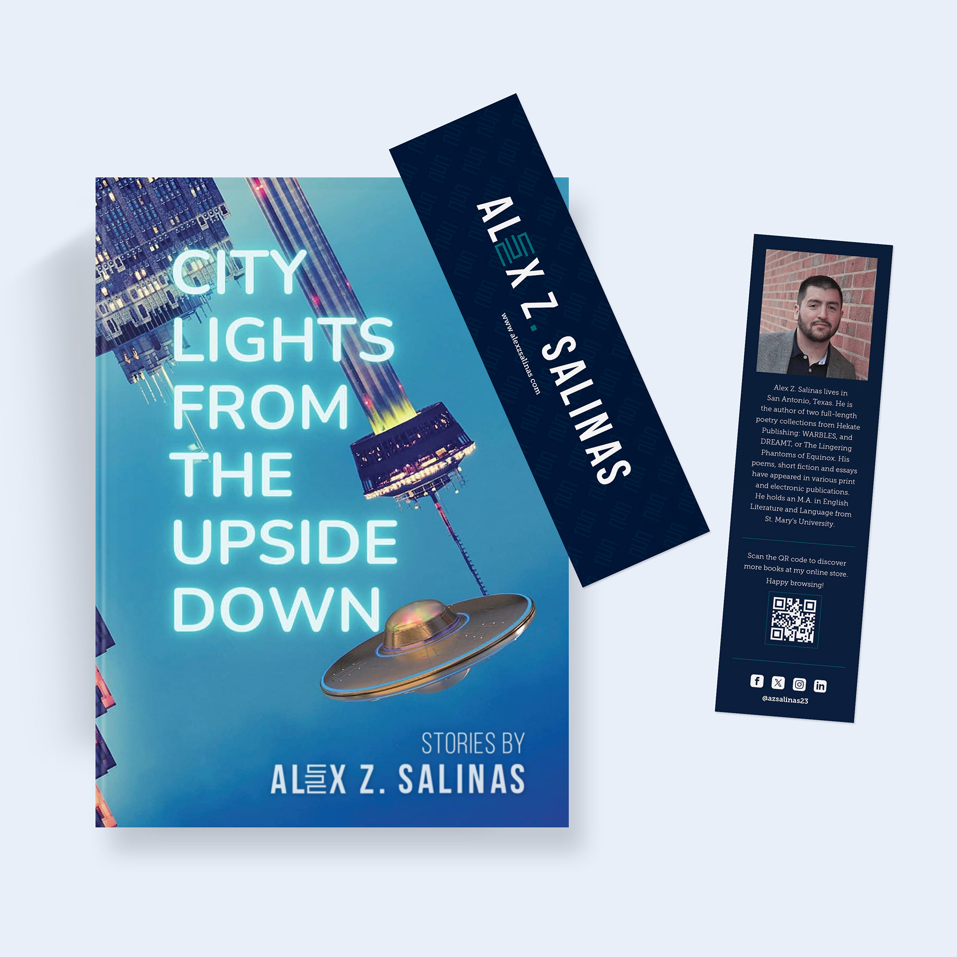
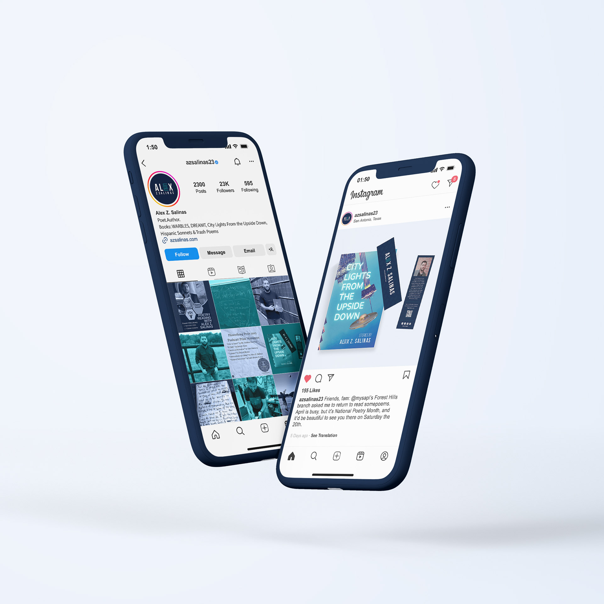
Logo design and branding for Alex Z. Salinas, author of four poetry collections and the storybook City Lights From the Upside Down, which was included in the National Book Critics Circle's Critical Notes. The concept behind his mark was to showcase his identity and one of his greatest passions: books. I creatively combined the letter 'E' from his name with the shape of a book, seamlessly integrating both elements into a distinctive typographical logo. It also represents Corpus Christi, the place of his birth. The colors represent the different tones of blue reflected by coastal waters as sunlight passes through, from the shoreline to the open ocean.